Sunday, December 2, 2012

Anish Kapoor Gangnam Style Protest


My posts have been very Anish Kapoor heavy lately.  This is the last one for a while, I promise.  It has to be done though.  I posted before about the making of a Gangnam Style parody by Kapoor and many other artists in the London community, and the video above is the final cut.  

Chinese artist Ai Weiwei made a parody of the song Gangnam Style in protest of the harsh regulations that are placed on freedoms of speech and expression in China.  The video itself, obviously a breech of these regulations, was removed from the internet and banned in China.  


Protests come in many shapes and forms, some serious and some less so.  Obviously, the premise of this video is founded on an international viral sensation, Psy's Gangnam Style.  The original video, with it's own political undertones, is a catchy and sort of ridiculous song with an equally laughable dance to go along with it.  This video, though, made its way up through the top music charts, and though silly, it is arguably one of the most recognizable songs of this year.  What better medium for staging a viral protest?  You have a song that will likely be looked into via search engines world-wide and will be seen by a younger generation, the one that will take the reigns on make changes happen in the future for subsequent generations.  


A friend of mine argued that the video was a poor way to spend time and resources and that it won't change anything, but sometimes protests don't have to be about change.  Sometimes, someone just needs to stand up and say what everyone else is thinking even if they don't have a way to fix the problem.  We can't change everything, but someone can and will do what they can the more people speak up about it. Unfortunately, with the government in China, there is very little that anyone can do to really effect changes. 


Kapoor and the other artists did a good thing to show support for an artist that makes incredibly powerful works of art in protest of the atrocities in his area. Yes the video is silly and the song is ridiculous, but honestly, it's a lot more effective to get people involved in a project that is lively and catching. And the fact that Ai Weiwei himself used that song and that video provides a direct link between the two, making Ai Weiwei's video better known via Kapoor's. I like to think that Ai probably got a kick out of seeing other artists taking after him and probably could use the boost after most likely being frustrated that his own video was banned in the country that it would need to be shown in the most. 


My same friend said that it was just a publicity stunt for Kapoor.  I say, yes, it is a publicity stunt for Anish Kapoor and all of the museums and galleries and arts centers and other artists who were involved. Heaven forbid the art community actually come together to have a bit of fun and help out a fellow artist.  Outside of the "Art World" looking in many people often have the expectation of either intellectual pretentiousness or "off-their-rocker" idealists making up the majority of the community. Maybe this video will show a human side to the arts community.  One that is willing to have a bit of fun, to be silly, to recognize popular culture, and most importantly, to speak up for one of their own and show that they are with him and support him when he needs it.   

Wednesday, November 21, 2012

This is what the art community is all about


Fun, yes, but on a serious note, many thanks to Anish Kapoor for being both incredibly awesome and for supporting Chinese contemporary artist Ai Weiwei, whose own Gangnam Style parody was banned from the internet in China.  His original video can be seen here:  http://www.youtube.com/watch?v=4LAefTzSwWY

Thursday, October 18, 2012

Anish Kapoor: Perspective and Experience


Lisson Gallery in London is currently housing an exhibition of new works by Turner-prize winning artist Anish Kapoor, who has an astonishing career since his rise to distinction in the 1980s.  His artworks have caused a stir worldwide with his seemingly simplistic, organic stylistic characteristics.  His great Bean, is one of the most well-known tourist attractions in the United States, stationed in Millennium Park in Chicago. 

The exhibition we encountered today was no less sensational that I would have expected.  Focusing primarily on two collections, the gallery showed two markedly different approaches to artistic production and representation while maintaining a principle notion of exploring new approaches to experience and form.  The artworks force the viewer into a new kind of seeing, one that counts on optical illusion and perspectival contingency. 

The first collection is a new series of earth works presented in both wall and floor sculpture and painting that evoke natural formations of earth, rock, and coral using material and pigments that are extracted from earthen matter.  The wall art, a blend of painting and fixed earthen material on canvas, displays a contrast between a beautifully organic visual experience that contrasts with the raw materiality of the specific elements used to make the work that become more pronounced as you move closer to the canvas.  In this way, the viewer has to move in and out of the “world of the canvas” to obtain the overall aesthetic experience that it can and should provide to a willing audience.


In stark contrast to the incredibly raw, earthen sculptures and wall canvases of the earth works, Kapoor’s fiberglass hemispherical monochromes provide an extreme oppositional approach to a similar notion of optical experience.  The hemispheres are completely covered with solid bold colors that could not be more different form the earth tones that make up the earth works in the other rooms.  These works, however, are hung classically against the stark white walls of the gallery.  


To view them from the front, they appear to be vivid monochrome panels, two-dimensional discs that are suspended against a wall.  By walking to the side of the work, you see that they are, in fact, three-dimensional hemispheres that have an almost infinite quality when standing within their center.  


This creates new questions of perception and experience that again requires an active participation by the viewer and which brings into question deeper dualities:  matter and spirit, physical and optical, tangible and transcendental, evolutionary and transformative.


Wednesday, October 10, 2012

Dragonfly - Visual Analysis


Three meters long, dark, and skeletal, the bestial figure looms above the open space of the austere room.  It appears to be suspended in perpetual flight, halted in the pregnant moment of a turn with its body tensed and bowed like a spring waiting to snap.  Wings expand from a long slender body to reveal the likeness of a grand dragonfly trapped under the cavernous ceiling of the Tate Britain. 

Hovering high above its viewer, it hangs just out of reach but close enough that we feel its presence as a part of our own, in our own space.  It seems impossibly too large.  The elongated body stretches over the objects in the room and the audience alike, but with the shape of an insect, the over life-sized scale is imposing and disconcerting.  We feel smaller than normal and exposed as it lingers over our heads.

With quiet magnetism, it holds a captivating authority.  It stands out as its monochrome black body contrasts with the white of the walls around it.  The solidarity of the blackness becomes analogous with the metallic steel frame that builds the figure, a link that makes it seem mechanistic and robotic.  Though it seems to have industrial qualities in its material and construct, it exudes a lightness and buoyancy that contradicts the heaviness that steel typically evokes.   

It is composed of many individual slivers of steel shards that intersect to create the framework of a flying creature.  Each piece has rough-hewn edges like the rim of a crude knife that is cutting the air.  Some are long and slender while others are wider but punctured with holes.   The perforated pieces occupy the slabs of what appear to be the end of the tail and left side wings.  On the opposite side, arched angular cut outs are fixed into one another and fastened together to create the illusion of a set of wings protruding from the right side of the figure.  If you situate yourself directly underneath the piece, the wings fan out from the core of the body as though caught in the midst of work, but it is impossible to discern when and where they will next move. 

Thinner, more delicate steel wires build the frame of the body.  Where what we would assume to be the thorax is located, the framework expands with a three-dimensional geometric construct, providing a sense of bodily form while remaining transparent and purely structural.  The negative space between each metal strip becomes the interior filling for the body.  Along the middle casing there is a set of small cylindrical bars bent into obtuse angles repeated to produce the suggestion of a ribcage.  One long, thin line of metal runs along the side of the frame giving the outline of the body that is alluded to by the rest of the material.  This single strip connects the central segment of the figure to the stretched out point of the tail end of the insect.  Its extended curvature helps to emphasize the elasticity and tension of the body as it shifts through time and space.  The entire bodily construction is asymmetrical and is open to the side opposite the long strip, further emphasizing its illusion of movement.

The sculpture is held in place by a single bar projecting from the core of the body that is attached to a string that is fairly unnoticeable upon first glance.  This gives the appearance of the figure partaking in flight of its own accord, while also attesting to the artist’s incredible ability to create balance in a large work of metal sculpture.  The individual slabs of metal were fixed together beautifully to allow the piece to hang evenly horizontal by its central axis.  Being suspended by a single string, the piece acts a mobile that can rotate on its midpoint if provoked by some outside source. 

It is constantly on the cusp of movement, as though it will whip its tail and fly away if you let out a breath.  At the moment you do not know where it will go next:  if it will ascend to the ceiling, move down to our level, or continue on its present course forward.  Despite its bodily tension, there is stillness around the piece that you are more sensitive to as you interact with it.  If you stop to watch, you become hyperaware of miniscule adjustments.  You find yourself anticipating its next move but unsure of what will happen when it does.

Lynn Chadwick (1914-2003),  Dragonfly,  1951,  Steel,  2770 x 1060 x 260 mm,  Presented by the Contemporary Art Society 1951,  Tate Britain,  Room 1944-1959,  Theme:  A walk through the twentieth century

Incidentially, if I were to throw this sculpture into a vat of jello, the squirshy goop would soften the impact of the steel frame as it sliced through to clang at the bottom.

Tuesday, September 25, 2012

Tattoo Culture: Art of the Body


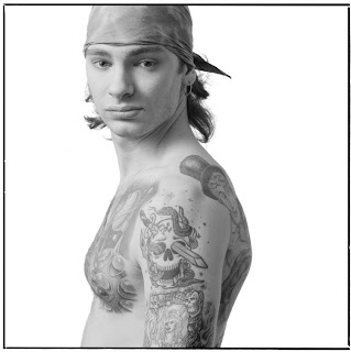
Last month, I was lucky to have visited the Arkansas Art Center with my mother to see their exhibition, Tattoo Witness:  Photographs by Mark Perrott.  With countless black and white portraits of “tatted” individuals, this exhibit encapsulates twenty-five years of tattoo culture from shops and studios across the nation. 

Perott captured images of tattoo artists and customers alike, documenting the artistry of the tattoos and the stories of the people who wear them.  He is immortalizing an ephemeral art that otherwise would only last a single generation.  Each portrait captures a moment in the subject’s life, as they proudly display the markings that set them apart from the rest of the world. 

Throughout the gallery, there are images of men and women; old and young; business and casual; clean and dirty; black and white and everything in between.  The exhibit challenges the viewer to question their preconceived notions of who gets tattoos and why.  Is a tattoo a scar that mars your body for the rest of your life, or is it an expression of your deepest passions and desires?  Is it a mark of childhood or a statement on trials you have overcome?  Does it show that you are a part of an elite club, or is it simply a way to display your love for artistic expression?  Is it a means to remembering an important moment or a lost friend?  Is it a symbol of infinite love?  Is it a call for attention or a means of blending in? 


In many ways, he illustrates the connection between the public and private nature of tattoos.   What a person does with their body is most often a personal choice.  By permanently decorating your body, you are making a choice to alter your appearance for personal reasons, of which could be any number of things.  Many times we are making a statement about ourselves or the world, about our feelings, our likes and dislikes or our place in the life we are living.  These personal reflections, no matter how conscious, are almost always factored into our decision to make a permanent change to our appearance.  That being said, in many ways, creating an outward alteration by means of tattoo expression is a very public presentation of our most private feelings.  It simultaneously shows the world who you are while becoming a part of your story.

Importantly, this exhibit brings people of various backgrounds and histories together with a common bond of artistic expression through a practice that has been around for thousands of years.

Incidentally, around the same time that I was exposed to Perrott’s photographs, I also came across an article about a Siberian ‘princess’ whose body was found preserved in permafrost, keeping her 2500 year old tattoos intact and easily observable.  ‘Princess Ukok’ is highly decorated with images of mythological creatures and intricate drawings that most likely exemplified age and status within her people. 


Like the tattoos that adorn our bodies today, her tattoos seem to be as aesthetic as they are practical.  The designs were placed carefully for viewing purposes, drawing on the presentation and public aspect of tattoo custom.  The body was, and is, another medium for artistic, personal, and societal expression and have amazingly stood the test of time.


Our cultures are constantly changing and evolving, often blending with those of others around us.  These two incredible examples of body art as a means of expression and symbol, each representing a vastly different civilization, really show that no matter how much people think we change over generations, we still employ many of the same practices that have defined us for thousands of years.  

Thoughts on a visit to see Thomas Houseago


“What’s your first impression of these sculptures?” my professor asks our group as we stand in the vast Hauser & Wirth gallery littered with Thomas Houseago’s latest exhibition, I’ll be your sister. 

“Monumental” was my first thought and consequently my uttered response.  Looking around the space you could not help but be slightly overwhelmed by these larger-than-life-size plaster and bronze sculptures. 

“Are you sure monumental?” the prof. questioned.  Silence.  I wasn’t sure if this was my first test or if it was simply a probe for the class to look at the sculptures again.  “This may be too soon in the course, but do you guys know of a maquette?” 

Monumental was right to describe these works but in a different way than I had realized before the professor’s remarks.  The works were large, yes, and somewhat overbearing, but they did not feel right.  Each had the appearance of a not quite finished model, a maquette, for a sculpture that was to be made in its likeness.  With this notion in mind, the scale, not to be confused with size, of the pieces presented a new interaction for the artist.  As Robert Smithson so eloquently stated, “Size determines an object, but scale determines art.”  Rather than the pieces feeling larger, the viewer felt smaller, as though having been shrunk down in the artist’s studio.  Connecting with the semblance of a maquette, each piece seemed to evoke the early stages of a sculpture’s life.  Each, if not eight to twelve feet tall, would appear to be an example of what a piece would look like if left in the planning stages in the artist’s studio with disjointed limbs, contorted poses, and unpolished exteriors.


Using mostly cast bronze, iron rebar, and plaster, the pieces seemed to evoke a structural integrity that remains a strong theme in modern erected works.  The central work in the exhibit, Striding Figure (Ghost), 2012, was predominantly made of bronze rebar bent and molded into a visceral, de Kooning-esque figure that loomed over the viewer has he strode forward, one foot placed in front of the other.  A contrapposto posture and rigid stance recalling the portraits of the Egyptian pharaohs commanded the audience’s attention, but as he leaned slightly forward over his stride, the viewer felt vulnerable as well as awestruck.  These attributes, however, were complemented by the viewer’s ability to look directly into the inner mechanics of the piece.  The rebar formed a sort of skeletal structure that gave the piece its shape.  Structural honesty seemed to be of utmost importance for the relationship between the piece and its audience. 

Like the central figure, the surrounding bronze and plaster constructions held a similar pattern of connecting the viewer with the art’s inner construction.  Each plaster cast, which incidentally was laced with impressions from the artist’s hands as he pressed and molded the plaster into the desired shape, called for the audience’s participation to see it to its core.  Breaks appeared in the sides of each work leaving various sized gaps for viewing the bronze configuration of holds in the inner workings of the piece.  Many of the gaps were large enough to be noticed but small enough that the viewer was forced to take it upon him- or herself to find the best angle to view the skeletal material. 


In the adjacent gallery space of the Hauser & Wirth lot, Houseago’s Special Brew continued this sculptural experience of structural honesty and connection with the naissance of sculptural practice.  This collection housed a few more figurative giants, each employing the same call for a deeper look at its inner care and each having disturbingly uncharacteristic nuances that made the viewer question whether it was ready to be seen.  Among these were a protruded head, a contorted arm, a mask-like face, an unsound and misshapen pedestal, and wooden blocks used for support as though they were found on a studio floor and shoved in open gaps to hold the piece together. 


Large panels leaned up against the stark white walls of the main room, each covered with primitive carvings and erections of what appeared mostly to be sculptural examples of sketches of body parts.  Two showed piled tube-like slices reminiscent of the tubes of clay used in the earliest training of sculpture making in visual arts courses.  Each panel evoked the drawing practices of artists such as Leonardo da Vinci, but, at the same time, had a grotesque quality that one would find in a post war image like Leon Golub’s Napalm Head or Pablo Picasso’s Guernica. 

These pieces tied into the theme of presenting the traditionally early stages of artistic production, as artists often use drawing as practice, study, and precursor to their “finished” works.  Additionally the panels draw on the notion of scale.  These eight and nine foot panels seem like they should be fixed into something, whether a book or a building, but whatever this thing may be, it’s scale is unfathomable and, like the figures of the first room, overwhelming. 

Visceral, regressive, and arguably primitive though these sculptures are, they create a need for the viewer to connect with them, to question them, and, most importantly, to understand what they are made of and where they came from.  It is almost like seeing the entire process of the sculpture’s creation sitting in one sedentary piece, while the piece is still very much alive in its interaction with the world around it.